Added in 24.11.
Aurora now offers you the ability to customize the email styling for your community using GraphQL.
The email styling allows you to customize the following parts of the email:
- Link
- Border
- Buttons
- Panel
Best Practices on Email Styling
- Khoros recommends using colors that work best on dark and light backgrounds.
- Use HEX or RGB colors only. Do not use HEXA, RGBA, HSL(A), and LAB colors.
- Buttons are standalone elements and are not influenced by light or dark mode settings.
- Email styling does not support CSS variables. For example, use #ff0000 and not var(--lia-bs-primary).
Use the createOrUpdateTheme mutation to create or update the email styling.
Parameters
The parameters you can use to create or update the email styling are:
| Parameter | Sub-Parameter | Sub-Sub Parameter | Description | Required |
|---|---|---|---|---|
| id | The theme ID you want to create or update for email | Yes | ||
| The email theme settings | No | |||
| link | The email link settings. | No | ||
| color | The color of the email link | No | ||
| hoverColor | The hover color when a user hovers a cursor over the email link. | No | ||
| decoration | The decoration you want for the email link. | No | ||
| hoverDecoration | The hover decoration you want for the email link. | No | ||
| border | The border-related settings for email. | No | ||
| color | The border-color | No | ||
| buttons | The buttons related settings for email. | No | ||
| borderRadiusLg | The border-radius of the email button. | No | ||
| paddingXLg | The horizontal padding of the email button. | No | ||
| paddingYLg | The vertical padding of the email button. | No | ||
| fontWeight | The font-weight | No | ||
| primaryTextColor | The primary text color of the email button. | No | ||
| primaryTextHoverColor | The primary hover text color of the email button. | No | ||
| primaryBgColor | The primary background color of the email button. | No | ||
| primaryBgHoverColor | The primary background hover color of the email button. | No | ||
| primaryBorder | The primary border color of the email button. | No | ||
| primaryBorderHover | The primary hover border color of the email button. | No | ||
| panel | No | |||
| borderRadius | The border-radius of the panel. | No | ||
| borderColor | The panel border-color | No |
Example
Use the below GraphQL mutation to create a customTheme1 for email styling.
mutation UpdateEmailStyling {
  createOrUpdateTheme(
    themeInput: {
      id: "customTheme1",
      email: {
        link: {
          color: "#910018",
          hoverColor: "#5c000f",
          decoration: "wavy underline",
          hoverDecoration: "wavy underline"
        }
        border: {
          color: "#7b802d"
        }
        buttons: {
          borderRadiusLg: "20px",
          paddingXLg: "20px",
          paddingYLg: "10px",
          fontWeight: "400",
          primaryTextColor: "#141401",
          primaryTextHoverColor: "#141401",
          primaryBgColor: "#faff91",
          primaryBgHoverColor: "#f7ff5c",
          primaryBorder: "1px solid #141401",
          primaryBorderHover: "1px solid #141401"
        }
        panel: {
          borderRadius: "20px",
          borderColor: "#7b802d"
        }
      }
    }
  ) {
    result {
      id
    }
  }
 }
The GraphQL response:
{
  "data": {
    "createOrUpdateTheme": {
      "result": {
        "id": "customTheme1"
      }
    }
  }
}
Resetting to Default Email Styling
To revert the email styling to your community default email styling, use the below GraphQL mutation.
Note
The parameters and their description for the default email styling are the same as for creating email styling.
mutation UpdateEmailStyling {
  createOrUpdateTheme(
    themeInput: {
      id: "customTheme1",
      email: {
        link: {
          color: "#0069D4",
          hoverColor: "#0061c2",
          decoration: "none",
          hoverDecoration: "underline"
        }
        border: {
          color: "#e4e4e4"
        }
        buttons: {
          borderRadiusLg: "5px",
          paddingXLg: "16px",
          paddingYLg: "7px",
          fontWeight: "700",
          primaryTextColor: "#ffffff",
          primaryTextHoverColor: "#ffffff",
          primaryBgColor: "#0069D4",
          primaryBgHoverColor: "#005cb8",
          primaryBorder: "1px solid transparent",
          primaryBorderHover: "1px solid transparent"
        }
        panel: {
          borderRadius: "5px",
          borderColor: "#e4e4e4"
        }
      }
    }
  ) {
    result {
      id
    }
  }
}
The GraphQL response:
{
  "data": {
    "createOrUpdateTheme": {
      "result": {
        "id": "customTheme1"
      }
    }
  }
}
Default Themes
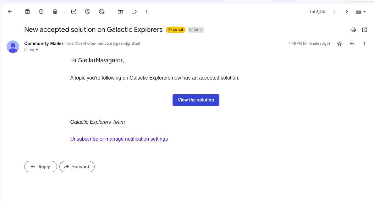
Accepted Solution
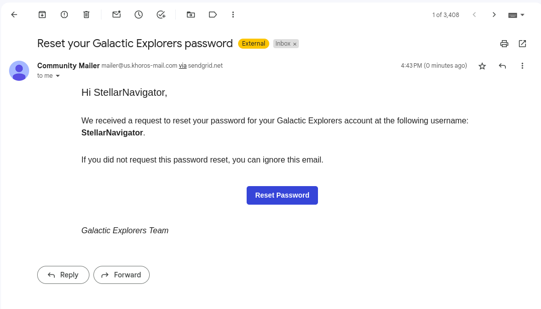
Reset Password
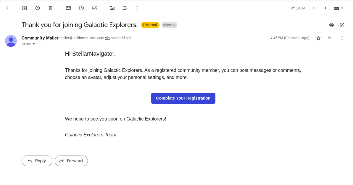
Complete Registration
ATLAS
Comments