A guide for creating Handlebars Components using git.
To create a custom Handlebars Component manually, you need to add the following:
- .component.json file
- A directory with the same name as the first portion of the name of your component.json file
- Handlebars template file inside the directory
Adding the component JSON file
The component JSON file is a descriptor file that describes a component "template" and one or more components created from that template.
For most use cases, you need to define only a single component in this JSON file. It can be used to define more than one component for the template, with a config and props object that overrides the defaults for the template.
The component JSON file stores the following properties:
| Field Name | Description | Example |
|---|---|---|
| id | A string field that defines the ID of the custom component. This should be the same as the part of the file name before the .component.json. | "id": "TopMembers" |
| markupLanguage | A string field used to specify the markup language to be used for the custom component. For Handlebars components, this should always be set to "HANDLEBARS". | "markupLanguage" : "HANDLEBARS" |
| defaults | An object containing the defaults for all the components that are defined to use this component's template. | |
| defaults/config | An object containing default configuration elements for all the components that are defined to use this component's template. | |
| defaults/config/applicablePages | An array containing the names of any specific pages that this component should only apply. If this array is empty, then this component is meant to be added to any page. If this array contains any page names, it should only be added to those pages. Note: The Page Templates UI in Aurora Designer will not show any components that are restricted to certain pages when editing pages that are not listed in the array. |
See below. |
| defaults/config/description | A string field contains a brief description of the component for displaying in page templates. Currently, we only support a single version of the description, so whatever language you type in it is always rendered. |
"description" : "Displays the Top Kudoers" |
| components | An array containing the actual custom components to use this template. All components need to have an id field that starts with the custom.widget. prefix.While you can define more than one component, you must have at least one component that has the id of the template after the custom.widget. prefix.For now, we recommend you to just add the one component. |
See below. |
defaults/config/applicablePages Example:
"applicablePages" : [
  "COMMUNITY",
  "CATEGORY",
  "FORUM_BOARD"
]
Components example:
"components" : [ {
  "id" : "custom.widget.TopMembers"
} ]
Here is an example component JSON file:
{
  "id": "TopMembers",
  "markupLanguage": "HANDLEBARS",
  "defaults": {
    "config": {
      "applicablePages": ["COMMUNITY", "CATEGORY", "FORUM_BOARD"],
      "description": "Top Members by Likes"
    },
    "props": []
  },
  "components": [
    {
      "id": "custom.widget.TopMembers"
    }
  ],
  "grouping": "CUSTOM",
  "aboutThis": null
}
Adding the handlebars template file
The below flowchart illustrates where you must place your handlebars template file in the main component directory.
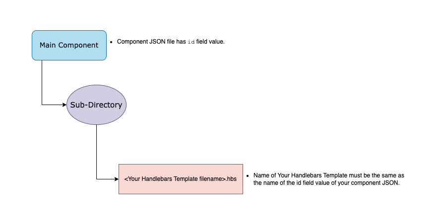
The handlebars template file must have the file .hbs file extension and the part before the file extension must be the same as the id field in the component JSON file.
Here is an example handlebars template file:
{{#gql "TopMembers"}}
  {{#with data.users.edges as |edges|}}
    <ul class="list">
      {{#each edges}}
        {{#with node as |user|}}
          <li class="list-item">
            <a
              class="user"
              aria-label="Member {{user.login}}"
              href="/users/{{user.login}}/{{user.uid}}"
            >
              <span class="avatar-wrap">
                <img
                  src="{{#if user.avatar.url}}{{user.avatar.url}}{{else}}/static/avatars/avatar-user-unknown.svg{{/if}}"
                  alt="{{user.login}}'s avatar"
                  class="avatar-img"
                  aria-hidden="false"
                  style="max-width:100%"
                />
              </span>
              <span class="user-name">{{user.login}}</span>
              {{#if @first}}
                <span class="badge-wrap">
                  {{#if assets.badge}}
                    <img
                      src="{{assets.badge.url}}"
                      class="badge"
                      alt="{{i18n 'badge'}}"
                      style="max-width:100%"
                    />
                  {{/if}}
                  <span class="sr-only">
                    {{i18n "firstPlace"}}
                  </span>
                </span>
              {{/if}}
            </a>
          </li>
        {{/with}}
      {{/each}}
    </ul>
    <p class="congrats">{{i18n "congrats"}}</p>
  {{/with}}
{{/gql}}
ATLAS
Comments