Added in 25.02.
In Aurora, you can add custom JavaScript files to any Handlebars components in your community Git repository to enhance them with user interactivity, dynamic content, content validation, and the ability to use data from an external API.
To add the JS, HBS, and JSON files, you must have access to your community's Git repository.
Basic Steps for Adding JS Files to Handlebars Component
- Create a component folder in your community Git repository.
- Create a
component.jsonfile to add a Handlebars Component Descriptor file. - Create an HBS file to create your Handlebars component.
- Create a PCSS file to apply styles.
- Create .js files in the component folder alongside your .hbs and .json files.
Note
The .js file name must follow a specific naming convention:
- The .js file name must be the same as the component folder.
- For multiple JS files, add the number for the script index.
Example:StyledComponent1.js,StyledComponent2.js, etc.
- Push all your changes to your community Git repository.
- Add the component to your page quilt.
Creating a Component Folder
Create a component folder in your GitHub repository: res/components/<ComponentFolderName>.
For our example, we use the folder “StyledComponent” in the repository: res/components/StyledComponent.
Example:
- StyledComponent.hbs is my component name
- StyledComponent.js is my first JS file
- StyledComponent1.js is my second JS file; 1 represents the index of the script
- StyledComponent2.js is my third JS file.
Creating a JSON file
The content of the HBS component descriptor JSON file is given below:
- Create a
StyledComponent.component.jsonfile in the StyledComponent folder. - Define the ID, markup language, config, component ID, and grouping for the JSON file.
- Add a
scriptGroupsobject to indicate when the scripts load on the page load. For reference, this is used in accordance with the NextJS Script Strategy. If this is not specified in your component descriptor JSON, the default strategy for loading your JS scripts will be set toafterInteractive. TheafterInteractivefield activates the code after a member selects the button. - Add the below example code for the JSON file.
{
  "id": "StyledComponent",
  "markupLanguage": "HANDLEBARS",
  "defaults": {
    "config": {
      "applicablePages": ["COMMUNITY"],
      "dynamicByCoreNode": false,
      "description": "Style Demo"
    },
    "props": []
  },
  "components": [
    {
      "id": "custom.widget.StyledComponent"
    }
  ],
  "grouping": "CUSTOM",
  "scriptGroups" : {
    "afterInteractive" : [ "StyledComponent2" ],
    "lazyOnLoad" : [ "StyledComponent3" ]
  },
  "aboutThis": null
}
Creating a HBS file
To use a .js file in an HBS component, here is an example of the “StyledComponent.hbs” component. When you click this button, the text changes based on the declared JS files.
<article class='custom-lia-article custom-lia-with-background'>
    <h3>My Article</h3>
    <p>Here is a component that should hopefully get globally styled in Aurora.</p>
    <div><button class="button" id="changeTextBtnHBS">Change Button Text</button><span id="changeTextBtnHBSID">Button Text</span></div>
    <div><button class="button" id="bgColorBtnHBS">Change Background Color</button><span id="bgColorBtnHBSID">Background Text</span></div>
    <div><button class="button" id="showMessageBtnHBS">Show Message</button><span id="showMessageBtnHBSID">Message Text</span></div>
    <div><button class="button" id="darkModeBtnHBS">Toggle Dark Mode</button><span id="darkModeBtnHBSID">Dark Mode Text</span></div>
</article>
Instead of the onClick function, we use a .js file to provide interaction based on the specified ID.
Creating JS files
To add and reference the JS files, we use the getElementById and addEventListener functions to reference the file and add interactivity within the Handlebars component.
-
Create a
StyledComponent.jsfile using the code below. Use the console.log to capture the event.const element = document.getElementById("changeTextBtnHBS"); element.addEventListener("click", styledComponent); function styledComponent() { document.getElementById("changeTextBtnHBS").innerHTML = "Clicked!"; console.log("Button Clicked"); } -
Create a
StyledComponent1.jsfile with the below code.const element1 = document.getElementById("bgColorBtnHBS"); element1.addEventListener("click", styledComponent1); function styledComponent1() { document.body.style.backgroundColor = '#' + Math.floor(Math.random() * 16777215).toString(16).padStart(6, '0'); console.log("Background color changed!"); } -
Create a
StyledComponent2.jsfile with the below code.const element2 = document.getElementById("showMessageBtnHBS"); element2.addEventListener("click", styledComponent2); function styledComponent2() { const message = document.createElement('p'); message.innerText = "You clicked the button!"; document.body.appendChild(message); console.log("Added child element to body!"); } -
Create a
StyledComponent3.jswith the below code.const element3 = document.getElementById("darkModeBtnHBS"); element3.addEventListener("click", styledComponent3); function styledComponent3() { document.body.style.backgroundColor = '#333333'; document.body.style.color = '#ffffff'; console.log("Dark mode toggled!"); } -
Create a
StyledComponent.module.pcssto provide styles for your component.@import 'mixins/_panel.pcss'; .custom-lia-article { display: flex; flex-direction: column; &.custom-lia-with-background { @include panel-defaults(); padding: 50px; } &.custom-lia-is-editing { pointer-events: none; } body { font-family: Arial, sans-serif; } .dark-mode { background-color: #333; color: white; } .button { display: block; margin: 10px 0; padding: 10px 20px; font-size: 16px; cursor: pointer; } }
Pushing the Changes to the GitHub Repository
- Create a commit and push your changes to the working branch of your community Git repository.
- Create a build in your GitHub repository to make sure that the component is loaded in your community site.
Adding the Component to a Page Quilt
To add the StyledComponent Handlebars component to a page quilt, do as follows:
- Sign in to your community.
- See Page Templates documentation for adding a StyledComponent (widget) to a page.
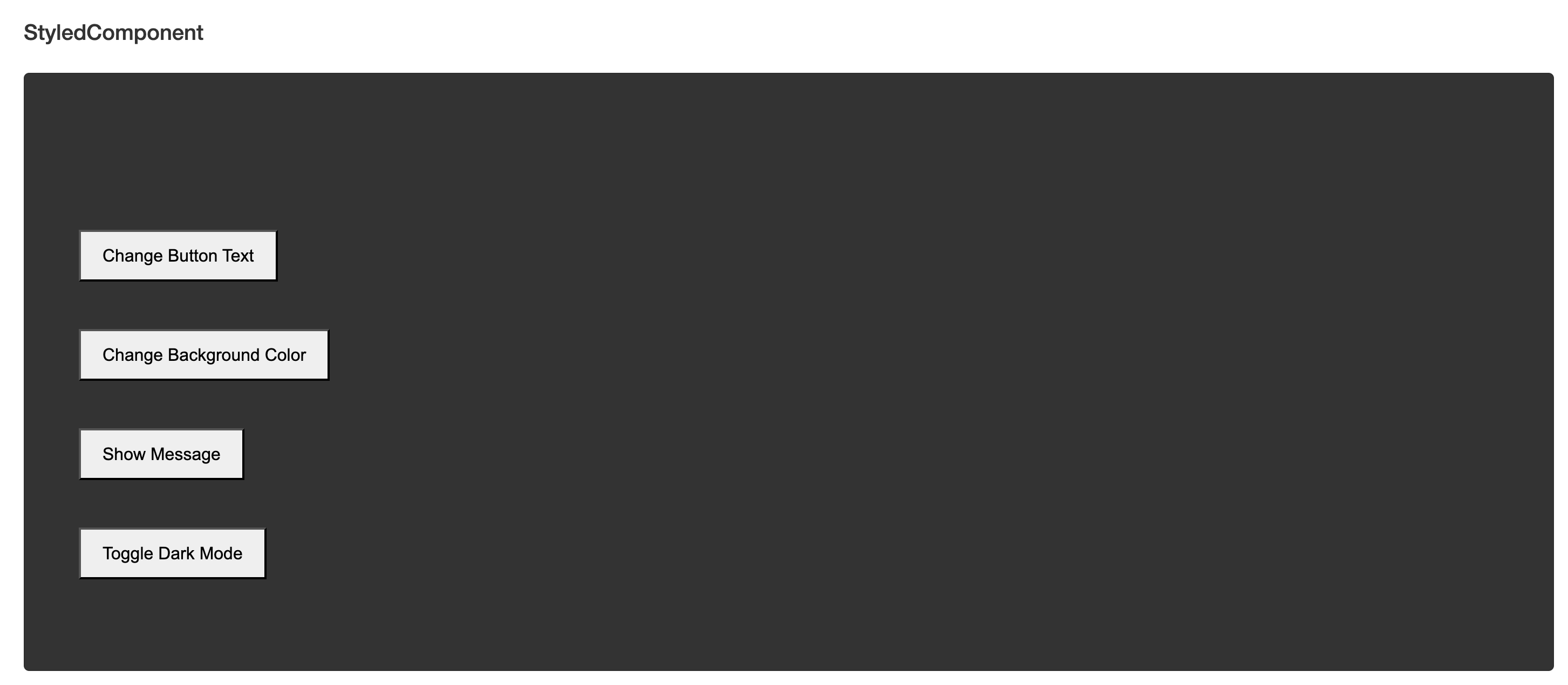
Here is an image of the “StyledComponent” component in a community page before interaction.
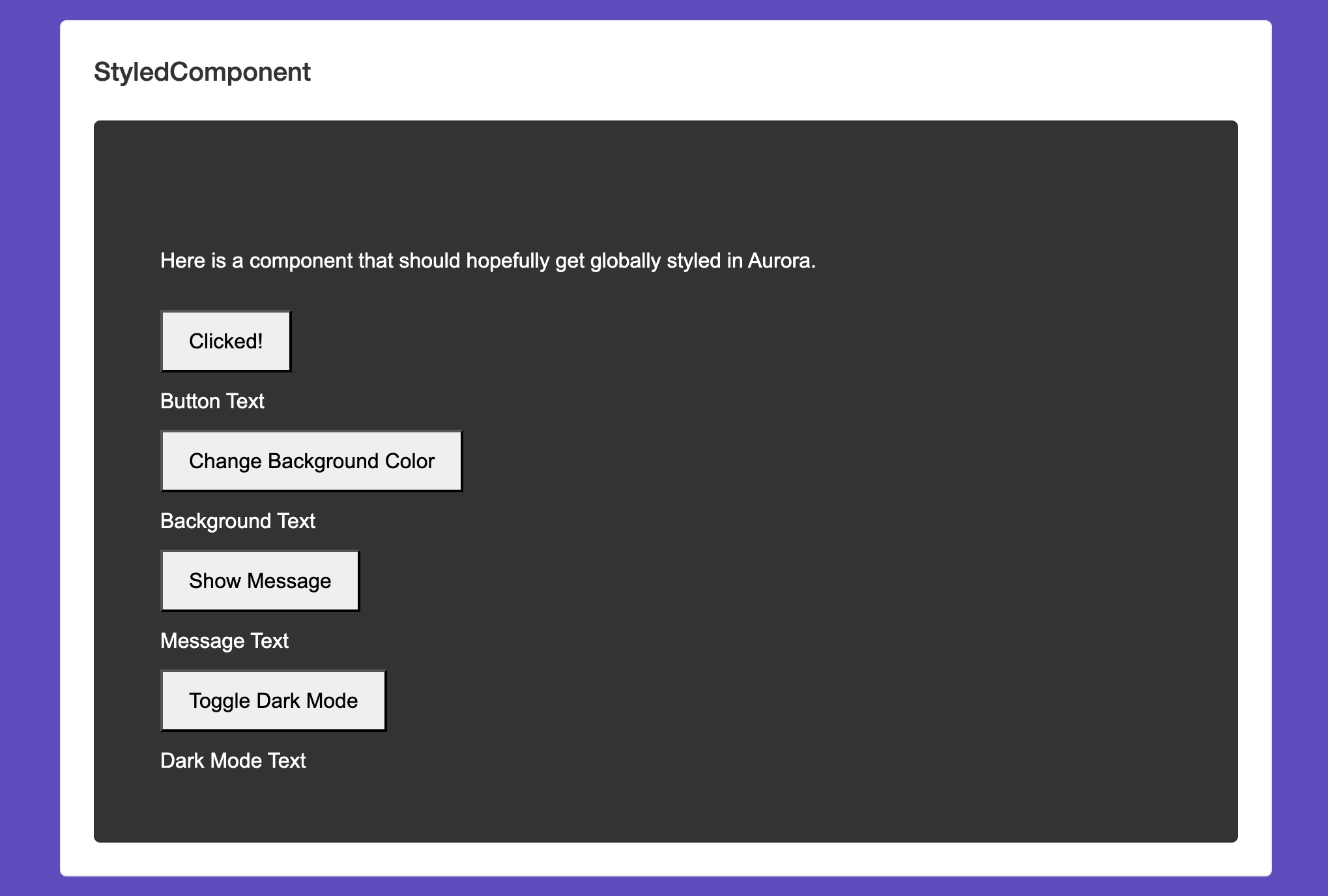
Here is an image of the “StyleComponent” after the interaction of selecting the Change Background Color button.
Conclusion
The above is an example of adding custom buttons with .js files using handlebars as a component. You can customize the .js files with different logic for your community to meet your desired outcome.
ATLAS
Comments